
van dender
2026
the client
Some brands don’t need reinvention. They need to return to their roots. Van Dender was one of those cases. The house already carried weight: heritage, craft, recognition, and a particular Belgian mix of seriousness and indulgence.
But the identity had started to drift. The logo felt dated. The visual language was uneven. Certain elements still had charm on packaging or in-store, yet lost their presence the moment they appeared online, reduced on a phone screen, or placed next to sharper, more contemporary competitors.
So the work began there. Not with disruption, with calibration.
identity
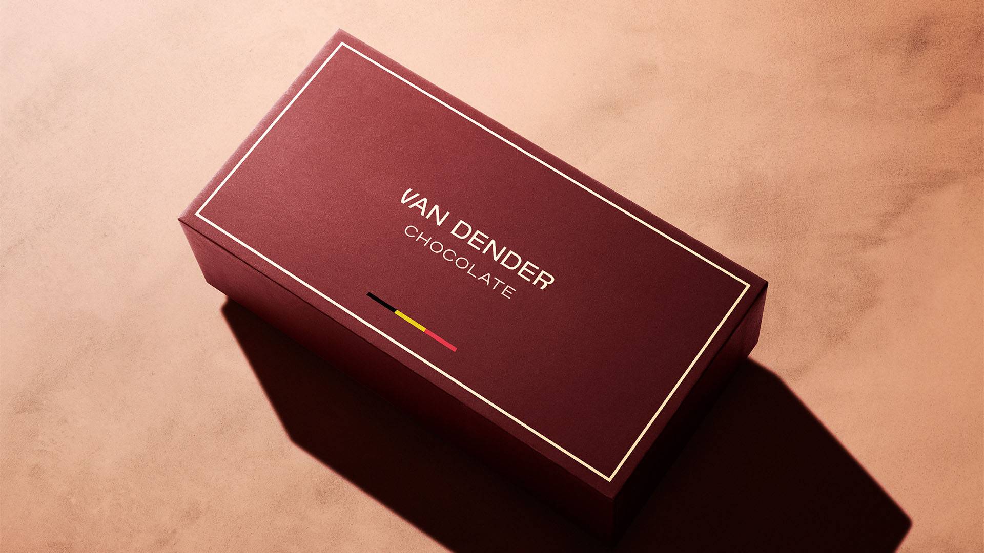
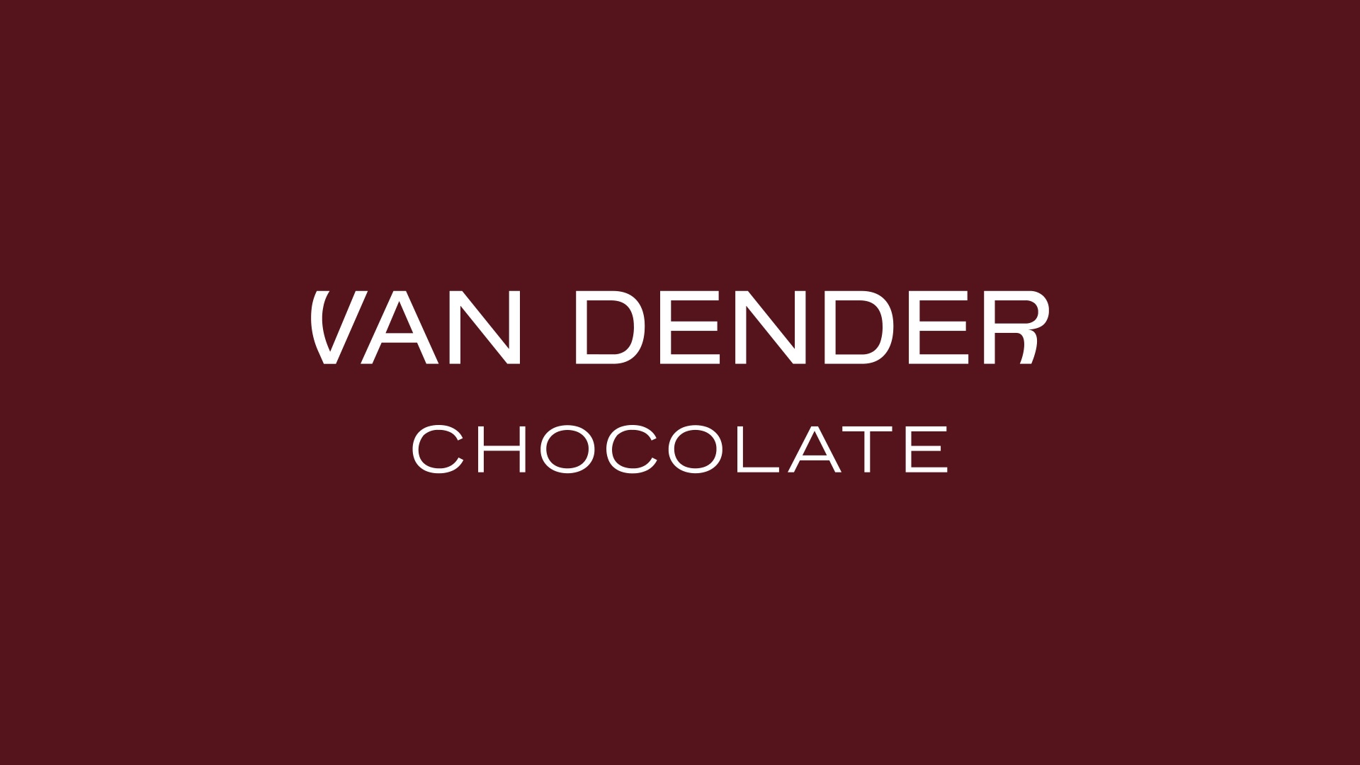
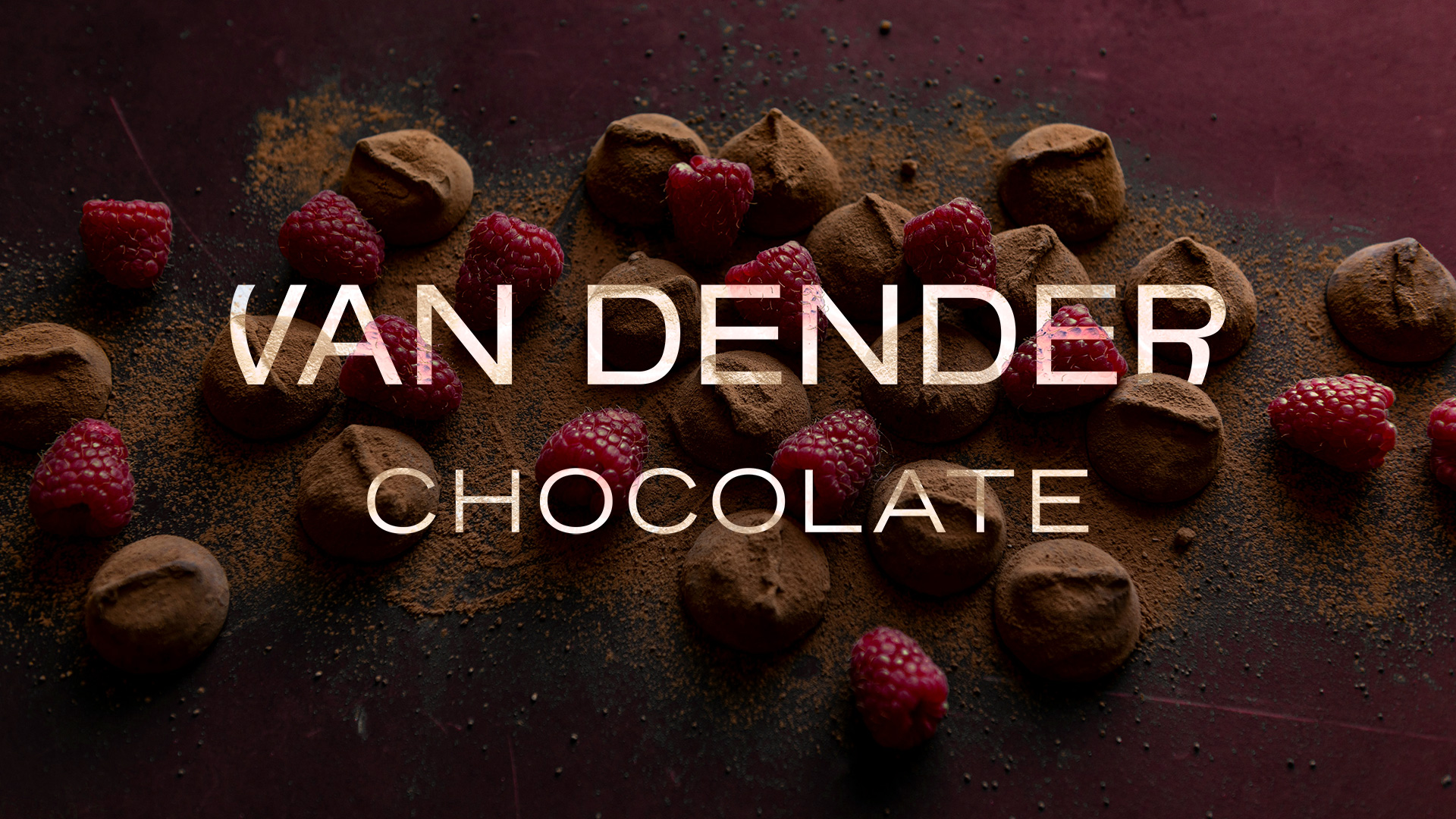
In collaboration with their team I reworked the identity around what was already true about the brand refinement: their outspoken legacy. A kind of quiet confidence that did not need embellishment. The outdated logo was replaced with a custom wordmark, drawn to feel more precise and more composed, while still keeping a classic rhythm in the letterforms. Not nostalgic. Not cold either. Just clearer, stronger, better balanced.
color
The color palette had to evolve too. We didn’t want to rely on tones that felt generic or overly decorative, and instead extensively researched 19th-century color symbolism, retracing early, forgotten trends. This led to the development of a rich combination of deep cocoa and muted burgundy, supported by restrained neutrals, to give the brand more depth and more consistency across print, packaging, and digital use. It immediately felt closer to the product itself. More grounded. More appetizing, oddly enough, without trying too hard.

an insight
An insight stayed with me. Luxury in this case did not come from adding detail, it came from deciding what to leave alone. That changed the direction of the work. I didn’t want to push the identity toward something loud or attention-grabbing. I focused on making every element feel deliberate, calm, usable, and enriched.
in the details
There was also a mildly ridiculous moment during the process, and I still remember it. We were comparing versions of the wordmark at a very zoomed-in scale, discussing line thickness with complete seriousness, when someone said it looked “too aristocratic” and we all had to stop because, honestly, how do you measure that when you’re zoomed in that far.
Still, that level of care was the point.
Still, that level of care was the point.
outcome
The final identity gives Van Dender a cleaner and more lasting foundation: a custom wordmark, a refined palette, a redrawn heraldic element, and a system built to hold together across shelf and screen. Elegant, yes. But more importantly, coherent.
The tradition was already there.
My role was to make it visible again.
The tradition was already there.
My role was to make it visible again.